C.W. Long Middle School

This is a Blogging website created by the students of Mr. Wilson's 7th grade math classes to inform the world of the issues that are concerning our planet's health from a mathematical perspective. Please leave us a post to let us know that you stopped by!

Friday, March 5, 2010


It is true that Arctic ice has been shrinking in recent years, but Antarctic growing at the same rate that global warming is melting it. So the chart says that global warming

Now as you can see in the south hemisphere the ice is melting over time. Now from the red line it
Says from 1979-2000 the ice stayed at the same level for 21 years. Now from the black line, it increased form 7 million to 15 million, and it decreased from 15 million to 2 million, now from 2 million it increased to 6 million. Now through October 2008 through November 2008, the ice was at 15 million square (km).


OVER THE YEARS THIS GRAPH SHOW HOW GLOBAL WARMING HAVE AFFECTED THE TEMPERTAURE ANOMALY FROM 1880-2000. THE DOTTED PURPLE LINE SHOWS ANNUAL GLBOAL MEAN. THE GREEN LINE SHOWS A FIVE YEAR MOVING AVERAGE. AFTER THIS INFORMATION, YOU SHOULD DO THINGS TO HELP THE EARTH INSTEAD OF HARMING THE EARTH.

Shuntae Snow, Vashanti Lawrence, Todreeka Gipson, and Natrecia Henderson
Math 7

We are doing a project on temperature changing over the years. We are using the years 1996 – 2008. On the line graph the temperature increases the most during the years 1996 and 2003. The temperature decreases the most during the years 1997,2001 and 2006.

water level rising


Sea Level Rising From 1880 to 2000

As you see in the graph above, the sea level has been rising due to global warming. We humans are tearing our world apart when we DO NOT REDUCE, REUSE, and RECYCLE. We need to step up and save our planet


How Much Continental Land do we have left To live on?


We don’t have much land to live on. Since water level is rising, we are losing land. If we reduce, reuse, and recycle, we could save our planet from going under water and we could also stop many natural disasters from happening.


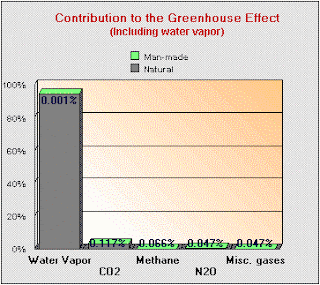


Water vapor has some of the world’s most interesting gas. At lease 95% of the earth’s green house is affected. Most people ignored the importance of water vapor. Water vapor is 99.999% of natural origin. Most humans activities contribute to green house gas such as farming, power generation, and transportation.
Kejuan Brown

Water Level Rising


Shuntae Snow, Natrecia Henderson, Todreeka Gipson
Math 7

We are doing a project on water level rising, and this line graph represents sea level when it rises and when it decreases. The yellow on the graph represent the sea level during 2008. The green represent the sea level during 2006. The purple represent the sea level during 2007. September through December was the months that the sea level decreased. January through May was the months that the sea level rised.


This graph shows some of the temperatures that are going to happen a few years from now and how close we really are to the sun. The global temperature is shown in the dotted lines. The 1st level of reconstruction is shown in the color black. The 2nd level of reconstruction is also shown in the color yellow.

Kejuan brown
Tramale mix

This is a picture of the earth and the ozone is getting bigger and bigger as time pass by. The reason for this is because of global warming. Some reasons for global warming are car gas, cutting down trees for fuel, dumping waste into the ocean, and etc. When these actions occur the ozone in the earth becomes enlarged. As a result of this the world is becoming in dangered.

The main causes of deforestation?
This graph shows the percentage of
Causes of deforestation. The key to this is like for every
Cause they use a percentage for thaat amount. Some up the amounts went up for the causess of deforestation.

Brazilian deforested


This graph shows how deforested is use over the years. This tells you that what happen over the latest years. If you look and see that it increase and decrease in 2004.


deforestation


This graph is showing deforestation in parts of the world Africa has half the percentage of deforestation meaning a lot of forests have been cut in Africa. Basically this graph is showing the major places of deforestation and the places where it least happens

Wednesday, March 3, 2010


This graph above shows the highest deforestation of natural forests, 2ooo-2005 All countries. Hectares per year. As you can see it starts with the highest, Brazil at its point of about 3,500,000. It ends at Nigeria with its lowest point of about 0. THIS IS REALLY AFFECTING THE RAIN FOREST.